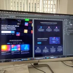



In today’s digital world, your website has to do more than just look good, it needs to work perfectly on every screen. With more than half of all website traffic coming from mobile devices, Google now prioritizes mobile-first design when deciding how to rank your site.
If your website isn’t mobile-friendly, you could be losing both visitors and visibility. Here’s why mobile design matters and how it affects your Google ranking.
1. Google Uses Mobile-First Indexing
Since 2019, Google has used mobile-first indexing which means it looks at the mobile version of your site first when determining your search ranking.
If your desktop version is solid but your mobile layout is broken, cluttered, or slow, your site could rank lower in search results, even for local queries.
2. Poor Mobile Design Leads to High Bounce Rates
Have you ever visited a website on your phone and immediately left because the text was too small, the menu was hard to use, or the layout was confusing?
That’s called a bounce, and Google tracks it.
A high bounce rate signals that users aren’t getting what they need and that can negatively affect your search position.
3. Mobile Speed Matters for SEO
Google doesn’t just care about how your site looks, it also cares about how fast it loads.
On mobile, things like large images, outdated code, and clunky themes can slow your site down. A delay of even a few seconds can cause people to leave and search elsewhere.
Faster mobile load times = better rankings and more conversions.
4. Mobile Optimization Improves User Experience
A mobile-friendly site is easier to read, navigate, and use, which means people are more likely to stay longer, explore more pages, and take action.
That includes:
- Tapping buttons with ease
- Reading clear, legible text
- Accessing menus and forms without frustration
Google rewards websites that provide a smooth, user-focused experience.
5. Mobile-Friendly Design Helps Local Businesses Win
If you’re a business in Orlando, a mobile-optimized site helps you stand out in local search results. When someone searches for a service “near me,” Google favors mobile-ready sites that load quickly and clearly communicate what you offer.
This is a huge opportunity for small businesses looking to compete in a crowded market.
How We Help at Orange Studios
At Orange Studios, we design every website with a mobile-first approach, meaning your site looks great and functions flawlessly on phones, tablets, and desktops from day one.
We optimize for speed, usability, and clarity, so your visitors stay engaged and your Google ranking improves naturally.
Is Your Website Mobile-Ready?
If you’re not sure, we’d be happy to take a look. A simple mobile optimization can make a big difference in how people find and interact with your business online.
📩 Contact Orange Studios for a free consultation and let’s make sure your site is built for every screen and every customer.